4 min read • 2025
Modernising Translink
People depend on public transport, but flawed design derails their plans.

TransLink approached us to transform the customer experience and boost public transport adoption in Queensland's car-dependent communities.
My Role
Overall, I was responsible for incorporating the final research into the prototypes, upgrading the design system, improving accessibility, and organising dev implementation.
Prototypes
Design Systems
Dev Handover
Challenge
Making public transport intuitive and accessible for all Queenslanders
As a public transport provider, the estimated audience of this app is incredibly diverse, so the focus was to create a clear universal experience that could work for anyone, no matter if it was their first time in Queensland - or their first time on a website.
I joined this large-scale, 2-3 year redesign project during its final year, working alongside one other designer and an EY design lead. By the time I joined, UX discovery was largely complete with additional research being completed on the client side.
Site Audit
A unique challenge for public transport
Queensland's car-dependent residents wanted digital transport solutions, but the state's outdated web app failed them when they needed reliable transit information most.
Lack of Visual Feedback
Users couldn't easily understand what was going on, when they needed too.
Inconsistent Patterns
Navigation and interactions felt unpredictable, with many obsolete pages and patterns.
Gaps in Mobile experience
The web app was not responsive or optimised for on-the-go planning, where it was most needed.
Poor information hierarchy
Critical details were hard to scan quickly, often hidden in walls of text or not existing in the first place.
Flexible Trip Planning for Every User
We designed a journey planner that accommodates different planning styles and reduces cognitive load. The planner saves your recent journeys and allows for live location tracking - of both yourself and the vehicle.
Research
Trip planning preferences vary dramatically by generation and technical expertise.
Less experienced users need visual cues and prefer maps, while power users prioritise speed and efficiency.
Solution
Implemented multiple happy paths allowing users to plan their journeys using both text and map based options, with smart suggestions such as 'current location' embedded throughout.
Advanced options, like bike riding and walking speeds, are available for power users requiring greater control over their journey.
Research
Trip planning is often done on the go, with people tracking their journey while it is being undertaken.
Solution
In the spirit of mobile-first design, we used progressive disclosure throughout the design, showing users only what they need to know at each step and not occupying unnecessary screen real estate.
Timetables: Meeting Users Where They Are
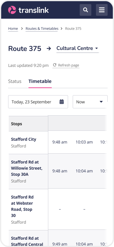
Timetables are often more complex than they appear. We designed an intuitive interface that lets users seamlessly navigate between the timetable, status zone and route map for any day and time, with flexible controls that put users in complete control of their journey.


Research
We observed a pattern of people trying to use timetables to infer other information and becoming confused by traditional tables, with people preferring visual mediums.
Solution
We designed a timetable with the default view being the map to suit processing habits. Disruptions and changes are highlighted via text and on the map itself.
Stops and Stations: Designing for accessibility
To enable independence, accessibility information needed to be immediately visible. We designed stops and stations to not only show the services they accommodate, but also display the features of the stops themselves.


Research
People with disabilities often felt uncertain about using public transport, with vital information buried in text
Solution
Clear iconography paired with written descriptions ensures scannable content design for quick information processing. Maps and photos implemented where possible.
Services and Service status: Keeping you in the loop
Service status shows all the known disruptions and changes a service, whilst services breaks down a routes to a singular, more granular timetable, with real-time tracking.


Events, projects, and articles
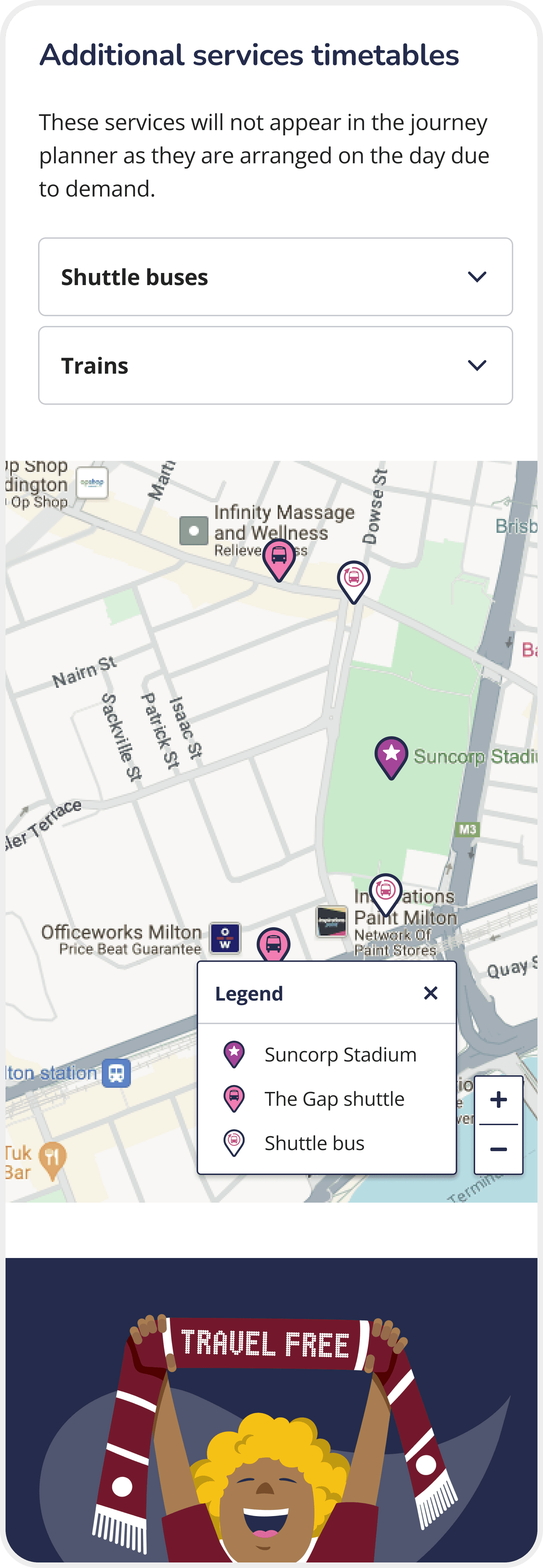
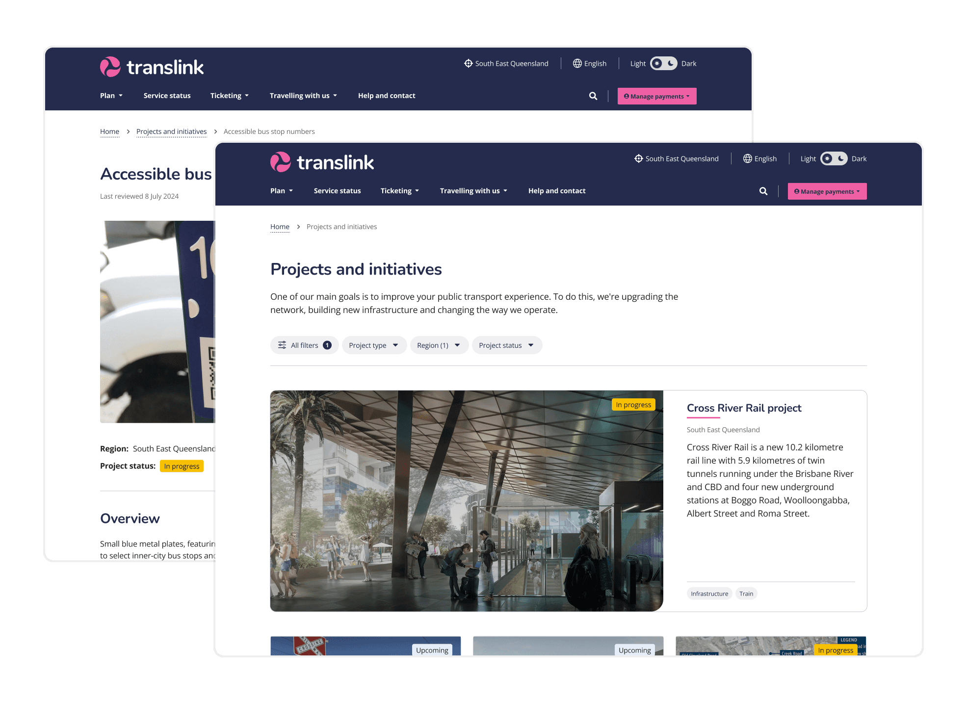
We took a similar approach when designing for longer content, like events, projects, and articles. Progressive disclosure was used liberally, showing the most important details at a glance, supplemented by images and graphics.

Research
Many users abandoned finding the sources of key information they need to attend events due to information overload, often seeking other sources instead like AI summaries.
Solution
Users can filter the content important to them via tag, with critical information called out at the top of each article, so you don't have to go digging.
Design systems
Scaling the design to last
Creating a design system for this scale was like architecting a small city. We built over 50 components that seamlessly worked across dark and light modes.
The real magic was integration. Every component was designed for the development team's workflow, ensuring future updates wouldn't require starting over.


Outcome
Transforming Queensland's public transport experience
Dom has worked efficiently without needing much direction, and has shown
initiative applying innovative solutions to challenges. She has become a trusted source of design feedback.
- Bri, Design Lead
Dom is a very talented designer with a key eye for detail and getting the UX right. You can really trust her work on really intricate details and components. - Liwei, Project Manager
